OriginLab Corporation - Data Analysis and Graphing Software - 2D graphs, 3D graphs, Contour Plots, Statistical Charts, Data Exploration, Statistics, Curve Fitting, Signal Processing, and Peak Analysis      
Show: Category: Graph Type: Sort By:

Unbalanced Grouped Box Plot
Read more...    More of same type...        More by same keywords...
Colormapped Line Series
Read more...    More of same type...        More by same keywords...
Line plot with cubic spline connection.
Read more...    More of same type...        More by same keywords...
Grouped Floating Bar
Read more...    More of same type...        More by same keywords...
Multiple-layer figure showing the energy-level structure of the Er3+ ion in a YAG crystal.  All energy levels are represented by horizontal drop-down lines.
Multiple-layer figure showing the energy-level structure of the Er3+ ion in a YAG crystal. All energy levels are represented by horizontal drop-down lines.
Read more...    More of same type...        More by same keywords...
Contour plot depicting vertical wind velocities as a function of time and height, overlaid with a vector plot depicting wind speed and direction.
Read more...    More of same type...        More by same keywords...
Grouped Box Chart with Customized Box Style
Read more...    More of same type...        More by same keywords...
Grouped column plot with asterisk bracket to show significant difference
Read more...    More of same type...        More by same keywords...
Four-panel graph showing the effects of varying input parameters on the objective function drain discharge in a 2D, variably-saturated flow model.
Read more...    More of same type...        More by same keywords...
Column Scatter Chart with Mean Line
Read more...    More of same type...        More by same keywords...
Grouped column plot with error bar
Read more...    More of same type...        More by same keywords...
2D Kernel Density Plot
Read more...    More of same type...        More by same keywords...
Scatter plot showing the absolute efficiency of an HPGe detector
Read more...    More of same type...        More by same keywords...
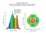
These two graphs display data from a study of dislocation densities on disk-shaped semiconductor wafers.  The first graph is a histogram generated from data stored in multiple worksheets.  The second graph is a scatter plot of the location of a measured value on the wafer.
These two graphs display data from a study of dislocation densities on disk-shaped semiconductor wafers. The first graph is a histogram generated from data stored in multiple worksheets. The second graph is a scatter plot of the location of a measured value on the wafer.
Read more...    More of same type...        More by same keywords...
Bubble Plot of Murder Rate and Cigarette Use
Read more...    More of same type...        More by same keywords...
Grouped notched box chart
Read more...    More of same type...        More by same keywords...
3D ternary surface with projection and label
Read more...    More of same type...        More by same keywords...
Smith chart graphing impedence in transmission lines.
Read more...    More of same type...        More by same keywords...
Grouped Scatter Plot
Read more...    More of same type...        More by same keywords...
Properties of miniature postsynaptic currents (mPSCs) at the C. elegans neuromuscular junction. This example combines graphs created as separate layers and added into the same graph window.
Read more...    More of same type...        More by same keywords...
Unbalanced Group Plot
Read more...    More of same type...        More by same keywords...
3D scatter plot showing two drilling locations and several drill samples taken at those drilling locations.
Read more...    More of same type...        More by same keywords...
Shadowgraph signals vs. scattering wave vector for a mixture of glycerol and water undergoing free diffusion in the presence of a concentration gradient.
Read more...    More of same type...        More by same keywords...
Multiple-layer presentation of data from magnetic analysis of alloy powders.
Read more...    More of same type...        More by same keywords...
This graph displays differences between ?armonic Oscillator?and ?orse?potential energy functions and the resulting vibrational energies.
Read more...    More of same type...        More by same keywords...
Bitspur graph with two panels.  The top panel features a double-Y plot representing engine speed and mass air flow.  The bottom panel contains a second plot representing switch/control variable states over time.
Bitspur graph with two panels. The top panel features a double-Y plot representing engine speed and mass air flow. The bottom panel contains a second plot representing switch/control variable states over time.
Read more...    More of same type...        More by same keywords...
Contour plot showing US voters arranged on a two-dimensional policy space, with the Y-axis representing social values (higher = more liberal), and the X-axis representing economic values (higher = more conservative).
Read more...    More of same type...        More by same keywords...
Individual contour plots on left side ovelayed with transparency on right side.
Read more...    More of same type...        More by same keywords...
mRNA expression relative to control for two different experimental treatments, plotted as a 2D bar graph with log10 axes.
Read more...    More of same type...        More by same keywords...
Population pyramid plot comparing age and gender distribution of centenarians in different countries.
Read more...    More of same type...        More by same keywords...
This graph portrays flood impact on the morphology of channels abandoned by rivers.  
It uses a Contour Color Fill plot to depict depth elevation and a Vector XYAM plot to show flow velocities.
This graph portrays flood impact on the morphology of channels abandoned by rivers. It uses a Contour Color Fill plot to depict depth elevation and a Vector XYAM plot to show flow velocities.
Read more...    More of same type...        More by same keywords...
Polar scatter with radial axis start at non-zero
Read more...    More of same type...        More by same keywords...
This multi-panel graph uses Origin? strong layering capability to represent high-resolution electron energy-loss spectra from a GaN surface.
Read more...    More of same type...        More by same keywords...
Grouped Floating Column Plot
Read more...    More of same type...        More by same keywords...
Scatter plot comparing a mathematical model with the actual kinematics of a pedestrian in a traffic collision.
Read more...    More of same type...        More by same keywords...
5 level grouped box chart
Read more...    More of same type...        More by same keywords...
Unicode Symbol Scatter
Read more...    More of same type...        More by same keywords...
Multiiple dot chart consisting of data points plotted on a simple scale.
Read more...    More of same type...        More by same keywords...
Box chart of temperature data with scatter plot and distribution overlay.
Read more...    More of same type...        More by same keywords...
Box chart representing water discharge data over three months.  Raw data is included to the left of each box in the form of a column scatter plot.
Box chart representing water discharge data over three months. Raw data is included to the left of each box in the form of a column scatter plot.
Read more...    More of same type...        More by same keywords...
Origin box chart presenting data from a study of the relationship between smoking and mortality.
Read more...    More of same type...        More by same keywords...
3D XYY wall graph profiling the optical response of a YBCO superconductor
Read more...    More of same type...        More by same keywords...
Micro-Raman spectroscopy of complex nanostructured mineral systems.
Read more...    More of same type...        More by same keywords...
Grouped Stacked Lines
Read more...    More of same type...        More by same keywords...
Grouped stacked bar chart
Read more...    More of same type...        More by same keywords...
Grouped bar chart with error bars and asterisk bracket
Read more...    More of same type...        More by same keywords...
3D Scatter plot combined with 3D Parametric Surfaces
Read more...    More of same type...        More by same keywords...
Crime rate comparison all over the United States with a bubble scale
Read more...    More of same type...        More by same keywords...
Multiple panel scatter graph showing water isotope ratios for D/H, 18O/16O, and 17O/16O in and out of cirrus clouds.
Read more...    More of same type...        More by same keywords...
Multiple trace line graph from metal alloy analysis.
Read more...    More of same type...        More by same keywords...
Grouped stacked column plot
Read more...    More of same type...        More by same keywords...
Smith chart graphing impedence in transmission lines.
Read more...    More of same type...        More by same keywords...
Scatter plot displaying water column sampling locations in Massachusetts Bay, with legend showing sample details and station names.
Read more...    More of same type...        More by same keywords...
This graph shows a comparison between the numerical and theoretical values of spatial correlations in a Monte Carlo simulation.
Read more...    More of same type...        More by same keywords...
Grouped 100% stacked bar plot with multi-line label
Read more...    More of same type...        More by same keywords...
2D waterfall and scatter plot illustrating data from experimental condensed matter physics research.
Read more...    More of same type...        More by same keywords...
Grouped box chart with color indexed datapoint
Read more...    More of same type...        More by same keywords...
Line graphs showing the results of numerical simulation of the temporal evolution of the output power of a Tm3+:ZBLAN fiber laser and the temporal evolution of the energy level population of the Tm3+ ions.
Read more...    More of same type...        More by same keywords...
Grouped box chart with gap between subgroups
Read more...    More of same type...        More by same keywords...
Multiple stiff diagrams on a map background
Read more...    More of same type...        More by same keywords...
Wind speed and direction over time represented in a windrose diagram.
Read more...    More of same type...        More by same keywords...
Box chart displaying simulated water discharge data for a water discharge station.
Read more...    More of same type...        More by same keywords...
Scatter Matrix Plot with Histogram in Diagonal Cells
Read more...    More of same type...        More by same keywords...
The Zoom Graph plot template includes a moveable rectangle which can be used to enlarge a region of interest.
Read more...    More of same type...        More by same keywords...
Bifurcation diagram for logistic map used in population studies under conditions of random migration.
Read more...    More of same type...        More by same keywords...
This two-panel graph shows an analysis of the dynamically changing shape of a single neuron over time.
Read more...    More of same type...        More by same keywords...
Polar plot representing four dimensions: bubble size, color, direction and distance.
Read more...    More of same type...        More by same keywords...
Line graphs showing results of numerical simulation of the temporal evolution of the output power of a Tm3+:ZBLAN fiber laser and the respective population inversion of the laser energy level.
Read more...    More of same type...        More by same keywords...
Area graph showing two groups of datasets plotted in separate panels.  The two panels are stacked on top of one another with no vertical gap between them.
Area graph showing two groups of datasets plotted in separate panels. The two panels are stacked on top of one another with no vertical gap between them.
Read more...    More of same type...        More by same keywords...
Bubble + Color Mapped Plot depicting earthquake data, both magnitude (bubble) and depth (colormap).
Read more...    More of same type...        More by same keywords...
Grouped Bar Plot
Grouped Bar Plot
Read more...    More of same type...        More by same keywords...
Three datasets plotted as lines with error bars and semi-transparent fill areas.
Read more...    More of same type...        More by same keywords...
Phase Diagram for the Superconducting Compound
Read more...    More of same type...        More by same keywords...
Plotting Bar/Column Graphs with Indexed Patterns
Read more...    More of same type...        More by same keywords...
XY error bar plot showing uniformity of laminar nozzle velocity.
Read more...    More of same type...        More by same keywords...
Campbell diagram for checking coincidence of vibration sources with natural resonances.
Read more...    More of same type...        More by same keywords...
YBCO superconductor growth study using multiple sets of axes and one offset to display deposition pressure, annealing pressure, and the change in critical temperature over time.
Read more...    More of same type...        More by same keywords...
A 3D colormap surface plot with contour projection in the XY plane.
Read more...    More of same type...        More by same keywords...
Multi-Panel Graphs Plotted by Grouped Data
Read more...    More of same type...        More by same keywords...
Typical Stack Lines by Y Offsets graph with four stacked curves and an XY scaler.
Read more...    More of same type...        More by same keywords...
Grouped Stacked Column Plot with Tick Label Table
Read more...    More of same type...        More by same keywords...
Piper diagram with TDS and point by point legend
Read more...    More of same type...        More by same keywords...
Multiple-lines plot depicting relative intensity data from four different measuring techniques, each represented by a different color.
Read more...    More of same type...        More by same keywords...
Scatter plot depicting decay and recovery curves obtained by taking two-photon fluorescence measurements of reversible photodegradation in a dye-doped polymer.
Read more...    More of same type...        More by same keywords...
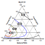
This ternary diagram displays the packing fraction when three particle types are combined.  Each line in the graph represents a constant value for the packing fraction as a function of the fractional contribution of the three particles (course, fine, and medium) in the mixture.
This ternary diagram displays the packing fraction when three particle types are combined. Each line in the graph represents a constant value for the packing fraction as a function of the fractional contribution of the three particles (course, fine, and medium) in the mixture.
Read more...    More of same type...        More by same keywords...
Multi-panel graph with multiple linked axes for visualizing complex data.
Read more...    More of same type...        More by same keywords...
Smart labeling with Y offest and special point
Read more...    More of same type...        More by same keywords...
Making Dynamic Inset Graphs
Read more...    More of same type...        More by same keywords...
Particle analysis study represented in two-panel column/bar graph with inset plots
Read more...    More of same type...        More by same keywords...
Fill partial area between curves
Read more...    More of same type...        More by same keywords...
Ternary chart with gradient fill for layer background, and color mapping of data points using another dataset.
Read more...    More of same type...        More by same keywords...
Four graphs with custom annotations depicting mid-range IR spectra of the acid form of zeolite SSZ-35.
Read more...    More of same type...        More by same keywords...
This graph depicts a mechanical realization of pseudo potentials used in mass spectrometers and radio frequency ion traps.
Read more...    More of same type...        More by same keywords...
Zooming into a Section of a Ternary Plot by Setting Axis Scales
Read more...    More of same type...        More by same keywords...
Water isotope ratios plotted in a 2D scatter graph.
Read more...    More of same type...        More by same keywords...
3D waterfall graph
3D waterfall graph
Read more...    More of same type...        More by same keywords...
AIDS vaccine research results depicted in a custom four-panel line and symbol plot.
Read more...    More of same type...        More by same keywords...
Scatter plot depicting the isotope signature of N sources found in IAB iron meteorites.
Read more...    More of same type...        More by same keywords...
Line and symbol plots showing the results of laminar flow nozzle design.
Read more...    More of same type...        More by same keywords...
Stacked bar chart with both X and Y normalized
Read more...    More of same type...        More by same keywords...
Grouped Stacked Bar Plot
Read more...    More of same type...        More by same keywords...
This column graph presents data from a study of population trends in the United States between 1950 and 1990.  Data from each age category is represented using a different column fill pattern.
This column graph presents data from a study of population trends in the United States between 1950 and 1990. Data from each age category is represented using a different column fill pattern.
Read more...    More of same type...        More by same keywords...
© OriginLab Corporation. All rights reserved.
× _ Let's Chat